House of Colorful Stories
Weber House, as seen in Sunset Magazine:
This Spanish Revival Home Used to be “Icky.” Now It’s a Family’s “House of Colorful Stories.”
CHRISTINE LENNON
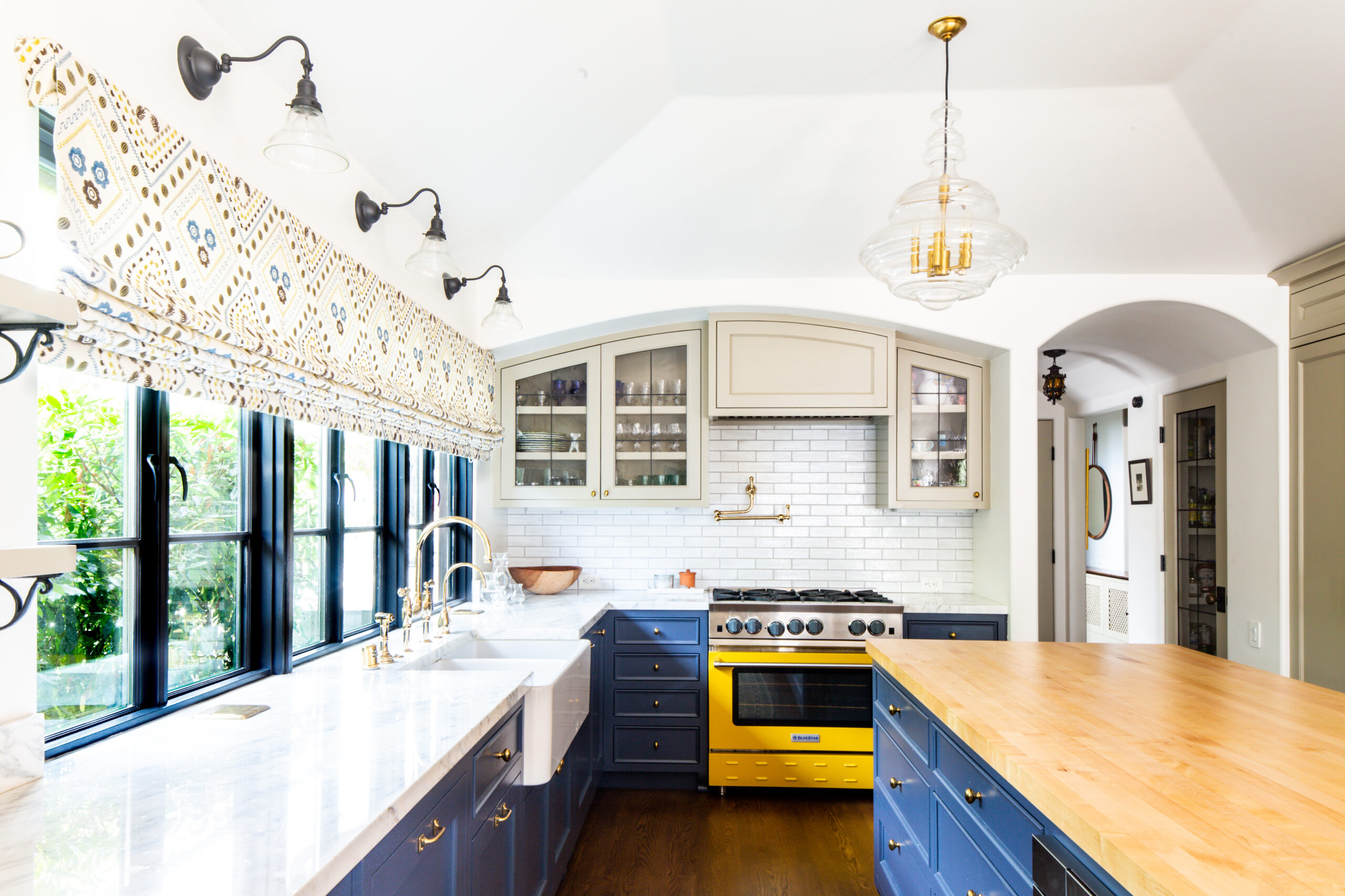
A yellow Bluestar range is the focal point of this remodeled family kitchen in Los Angeles.
Toni Lewis and Marc Schoeplein remodeled a 1930’s Spanish-revival house for New York transplant Rachel Weber, a painter with a sharp eye for color.
“The original house was icky,” says architect Toni Lewis, a partner at the Los Angeles-based architecture firm Lewis Schoeplein. “It had been mucked with over the years. It had a very small kitchen. There was no connection to the back yard. Our client, Rachel Weber, and her husband liked the convenience of the location and that it had character. But they came to us to help them make it work.”
Weber and her family, including her educator husband and their four kids, relocated from New York to Los Angeles with a few cherished family heirlooms and a massive collection of art. Weber has her MFA from Parsons, and needed wall space to display paintings she collected from friends over the years and some of her own work, which is vibrant and expressive. She also saw the potential to renovate this small, disjointed and dark house into a light-filled thoughtful home with confident, exuberant style.
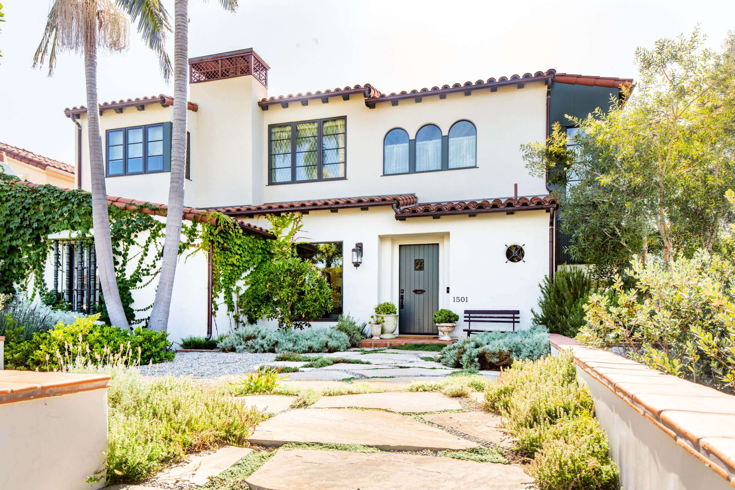
The original house was a single-story Spanish revival that had lost its way over the years. Lewis Schoeplein transformed it into a five-bedroom, light-filled family house. A few original details, like the small round window on the right, remain.
“It’s true, I do have a strong aesthetic,” says Weber, who worked with interior designer Alie Waldman on the home decor. “I like an eclectic look, not too traditional. To make this house work for our taste we developed a kind of thesis statement. We kept the bones of the house and the lighting more on the Spanish-side, with the exposed beams, arches, and dark metal fixtures. Then that gave us some room to experiment with contemporary furniture and art on the walls. I liked feeling free with the more superficial elements of the house.”
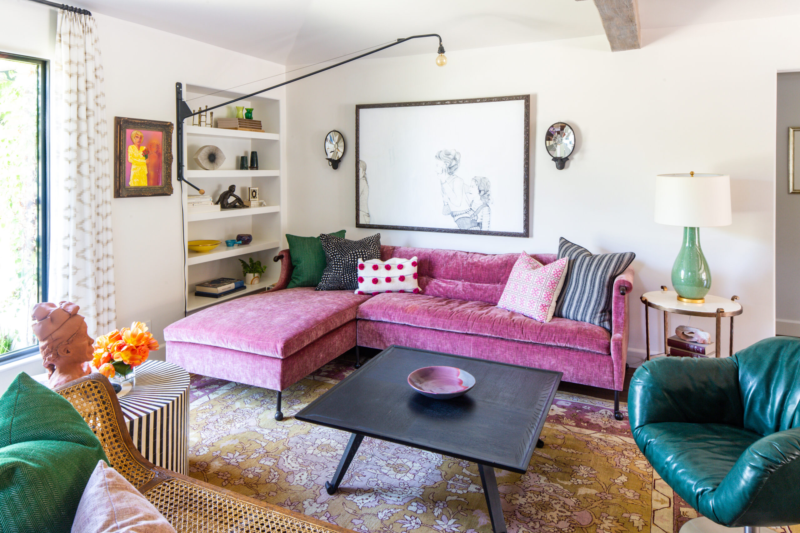
Weber grew up with this rug in her family home in Atlanta, and the heirloom was the starting point for the living room’s interior design. “People say ‘wow, you have a pink sofa. That’s bold,’” says Weber. “But I think pink can be a neutral.”
Some of the tricks Lewis and her partner Marc Schoeplein used to make the home feel more spacious and connect the flow of the rooms: They “trayed up” the ceiling in the kitchen to add height, installed full floor-to-ceiling storage, and a genius two-sided pantry between the kitchen and the dining room so dishes can be accessed from both rooms. The family bathrooms have a relationship to each other, with patterned tile on the floor and painted cabinets in bold colors like kelly green and cerulean. Lewis and Schoeplein also added arched doorway and window details throughout the house to stay true to its Spanish-revival roots.
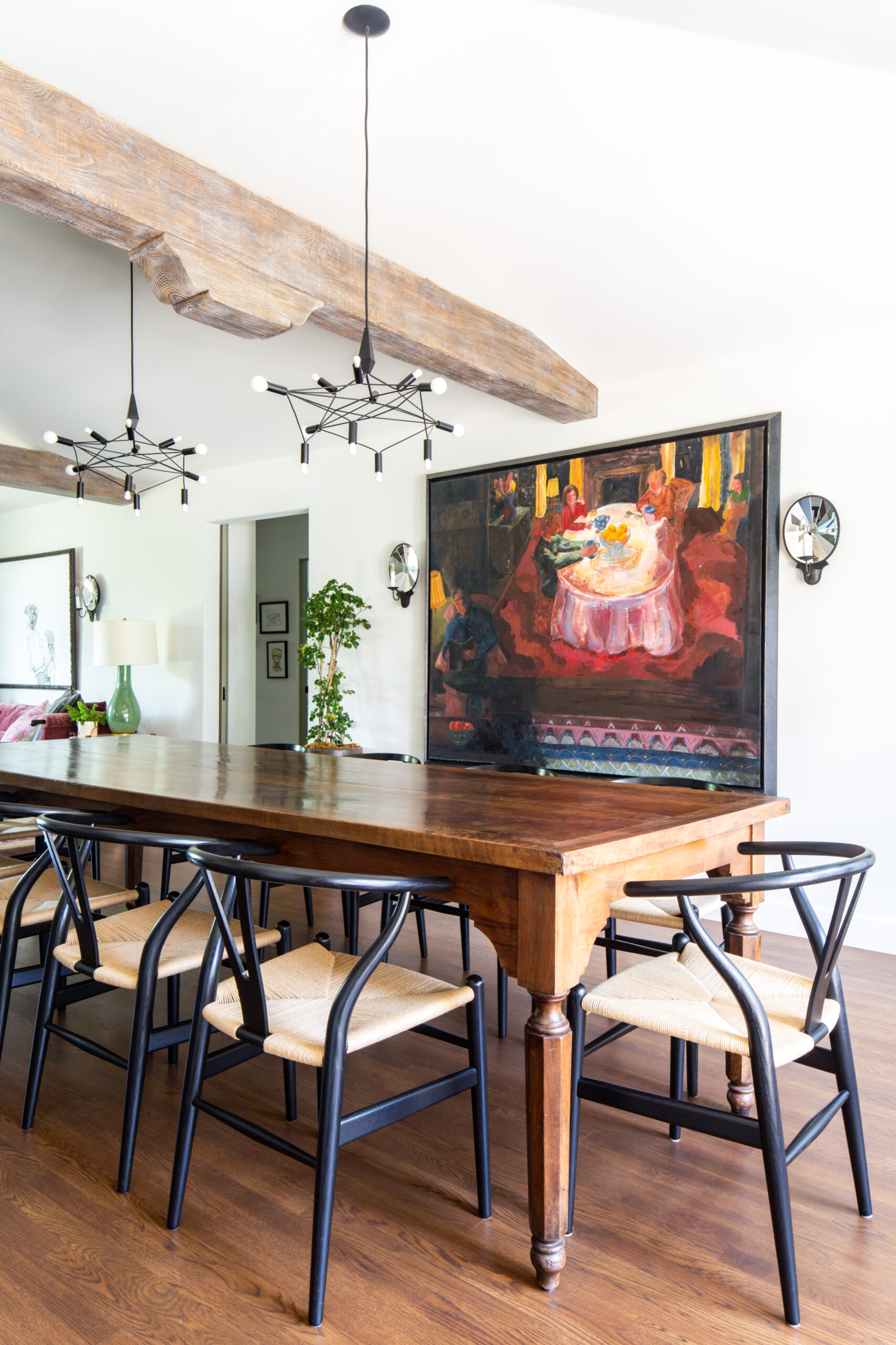
A faux painter was brought in to give the beams an authentic, weathered look. Wishbone chairs surround a traditional Spanish trestle table. Art work by Rachel Weber.
Lewis and Schoeplein designed the layout around a few of Weber’s family heirlooms, like a dining room buffet and a rug with an unusual color combination: violet, rose, and pea green, which suits Weber’s unusual style well.
“Surprisingly, I hadn’t seen Rachel’s artwork because it was all in storage,” says Waldman, who selected the patterned fabric, like the Raoul textiles curtains in a baby’s room, and the bold yellow School House Electric sconces in the play room without ever having seen the family’s art collection. “I had seen her existing furniture pieces and I had seen one or two pieces that were in the rental home they were in when they were renovating. It was sort of serendipitous, especially the large piece in the dining room. I hadn’t seen it until install day. And it all just worked.”
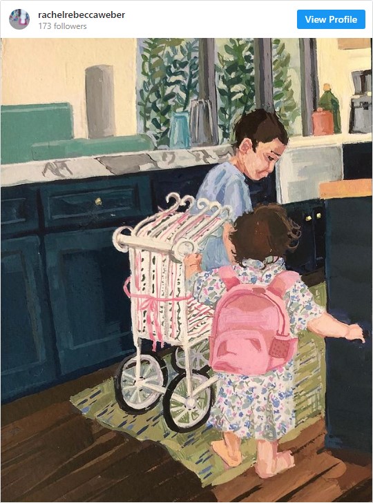
The house plays a supporting role in some of Weber’s recent work of her children at home during quarantine. Like this painting of two of her children in the family kitchen, and another in her young daughter’s room.
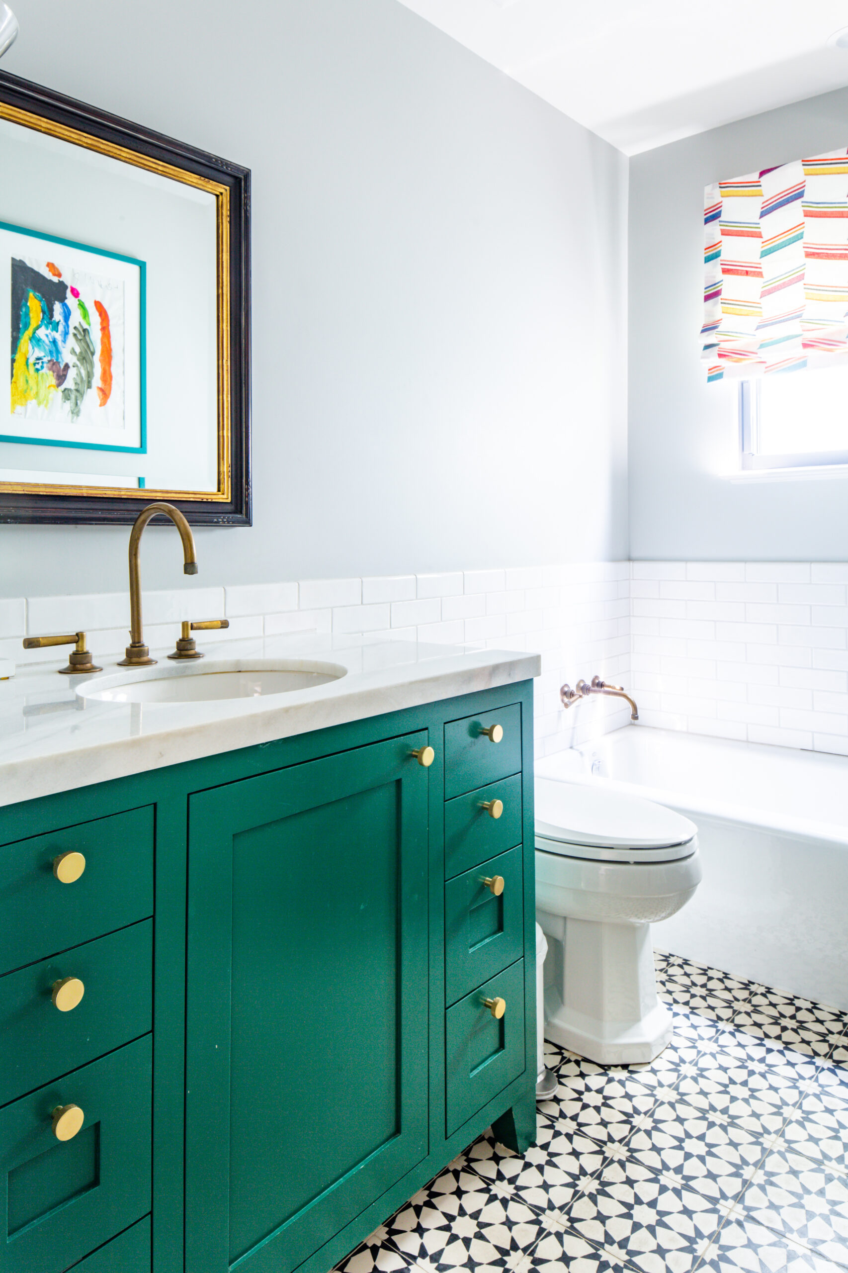
Every bathroom in the house has a pattern tile floor from Mission Tile West, and a cabinet painted in a deep color that’s roughly the same saturation level, like this Kelly green.
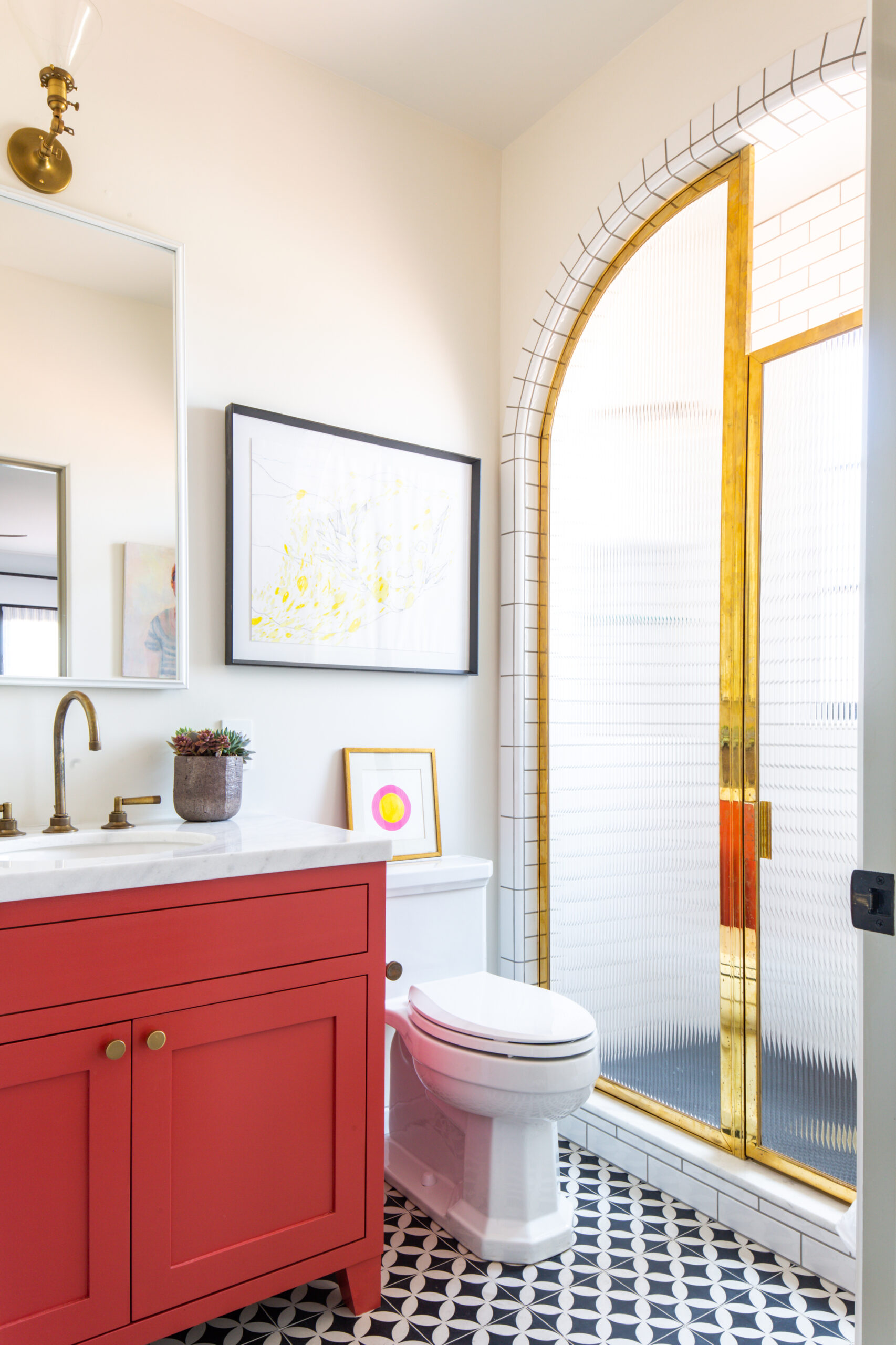
Another family bathroom adheres to the same design strategy: Patterned tile floor, tomato red cabinet, and brass accents. The bathrooms have a “relationship” says architect Lewis.
Rohl fixtures are used throughout the house, and bold patterns have been mostly reserved for floors and window treatments. All windows are painted in Black Bean (DE 6385) by Dunn Edwards, which is a soft near-black shade. The Walls are Dunn Edwards Whisper (DEW 340) , and the interior doors are Flintstone (DE 6221).
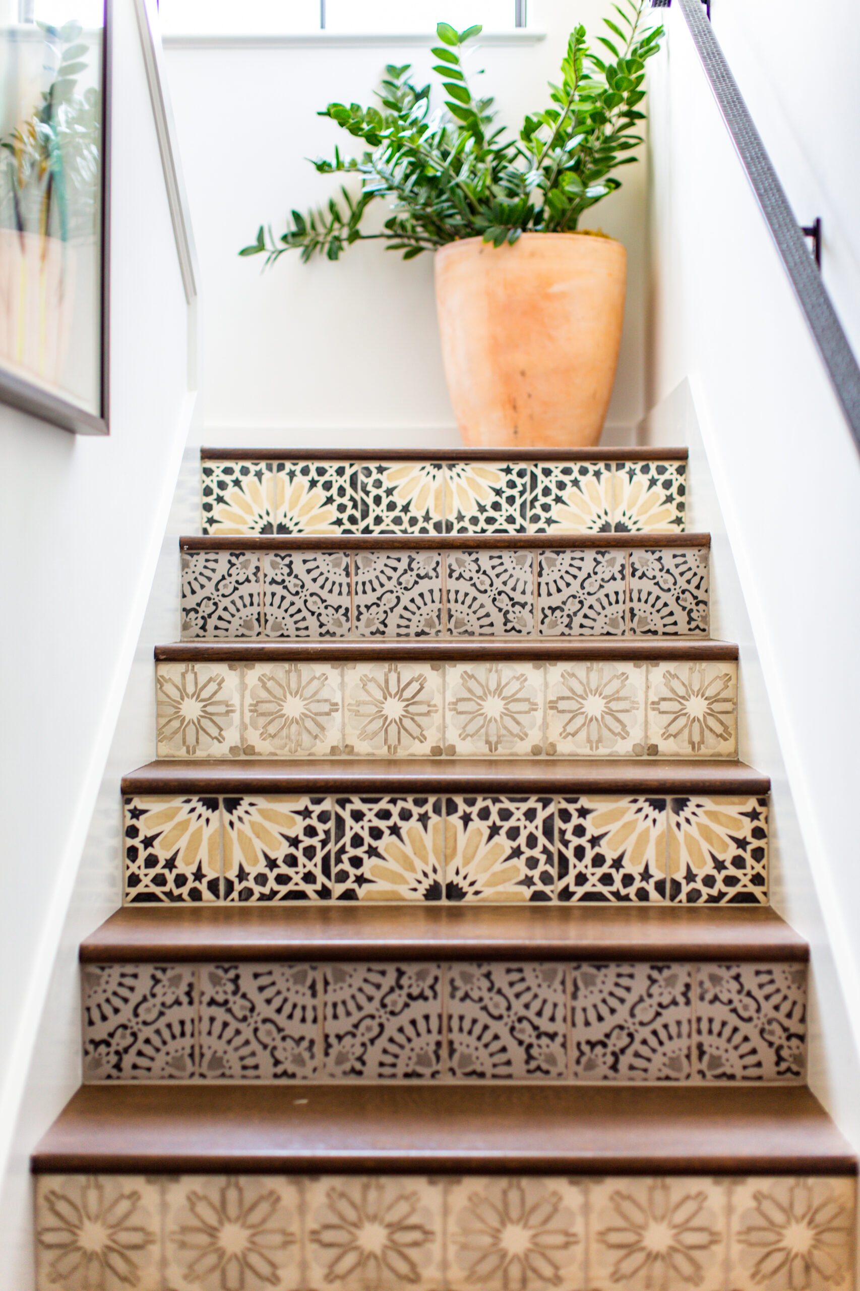
A well-lit stairwell is the perfect spot to feature tiled risers, a nod to traditional Spanish style, but with modern flair.
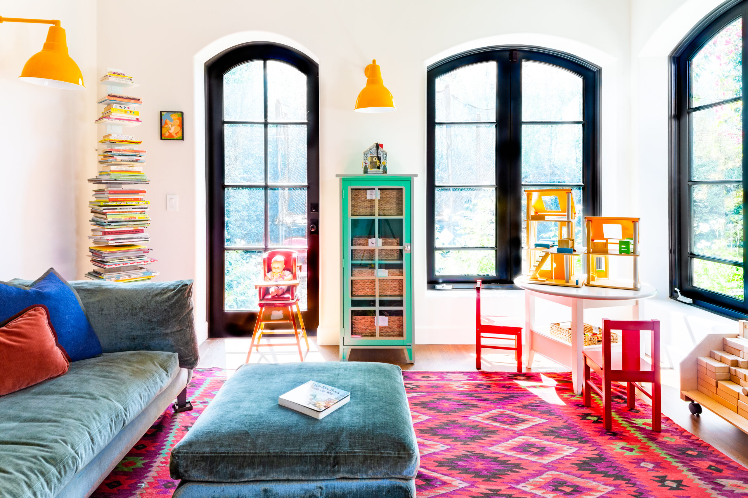
Arched window frames nod to the home’s 1930s roots, but the interior—with a bold pink kilim-style rug and yellow barn lights—is very of-the-moment.
Lewis refers to the home as “The House of Colorful Stories,” referring to the big, active family that resides there, and Weber’s own confidence with experimental colors. “Honestly, as a painter, I think of colors like orange and pink as neutrals,” says Weber. “I am not afraid of color at all.”
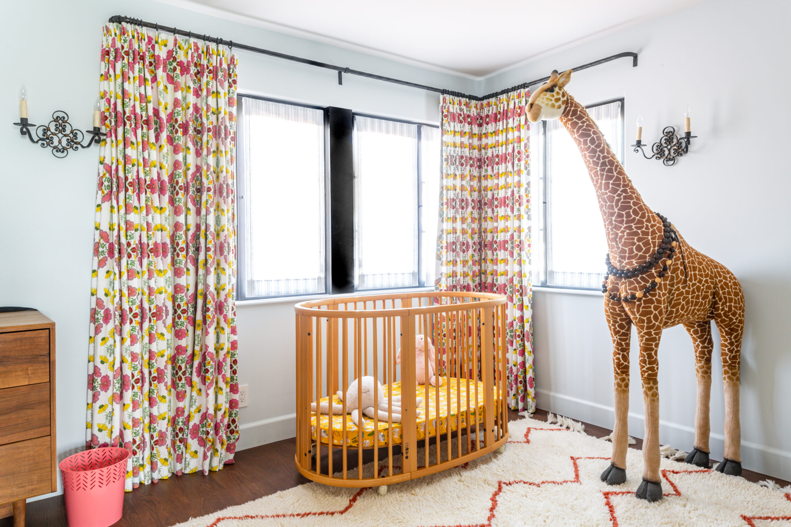
A baby’s room gets a sophisticated Raoul Textiles window treatment that will transition well into her teens.
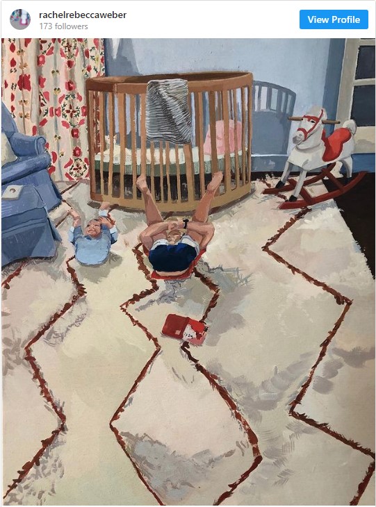
Here’s the same room depicted in Weber’s figurative painting. (Incidentally, commissions are available. Contact Weber through her Instagram page.)
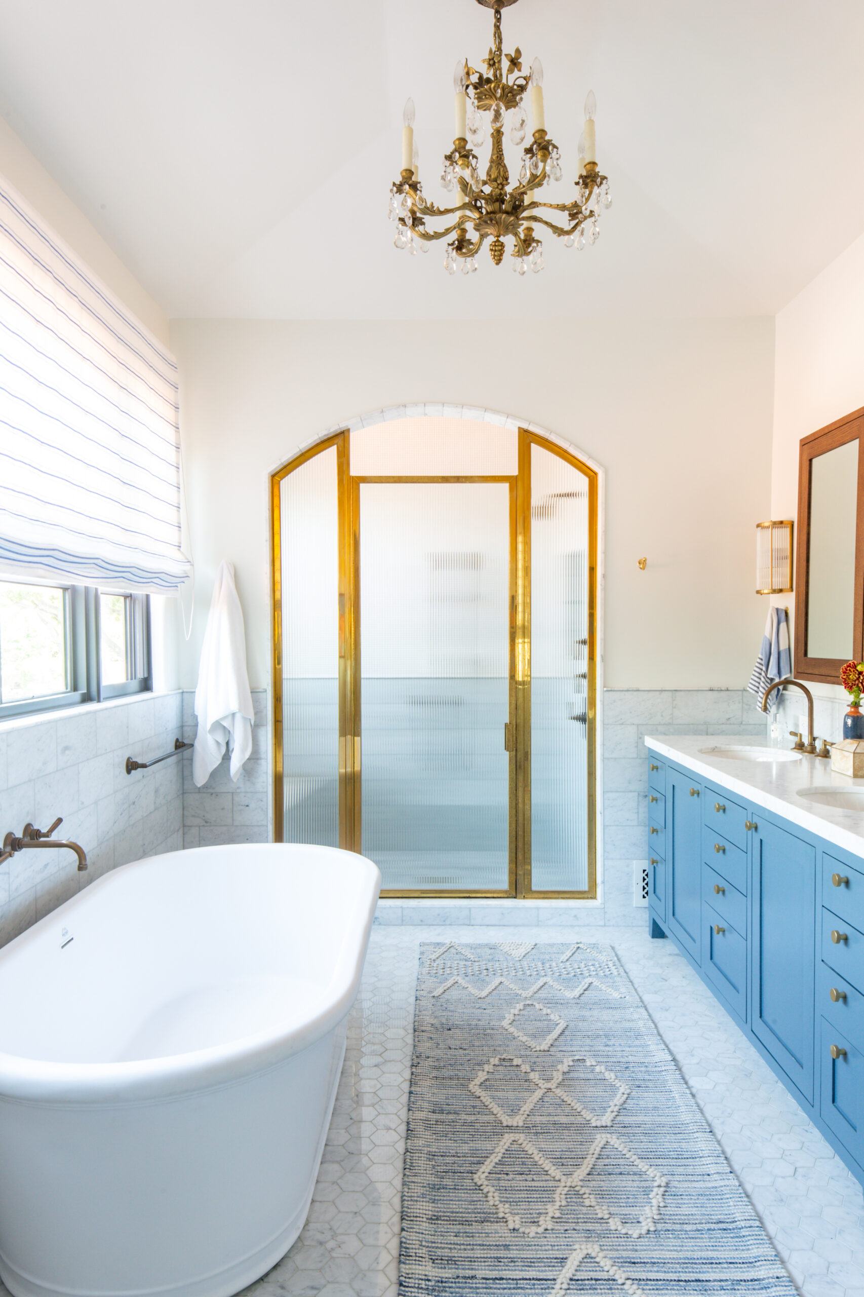
In the primary bathroom, cornflower blue painted cabinets offset a more formal marble floor and brass-trimmed shower doors.
Building this fountain was a labor of love. Weber searched for a green vessel to coordinate with the Moroccan pattern tile, and the masonry was a challenge.
“People ask if we’ll ever build a pool,” says Weber. “For what it cost to build this fountain, we might have built a pool instead.”
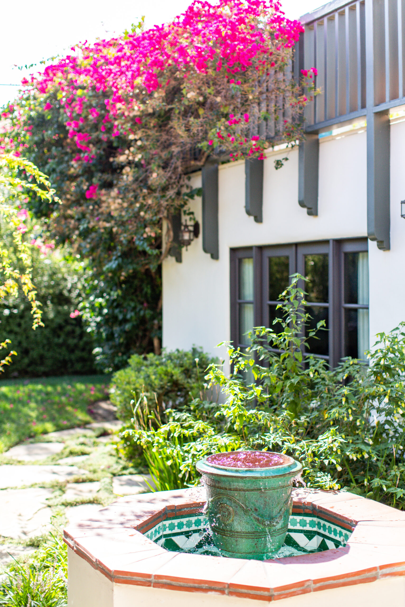
The backyard fountain was decorated with Moroccan tile and a glazed vessel.
All photos by Marisa Vitale


