Big Rock
PROJECT TYPE Residential
LOCATION Malibu, CA
PHOTOGRAPHER Lucy Gonzalez
Mid Century in Malibu
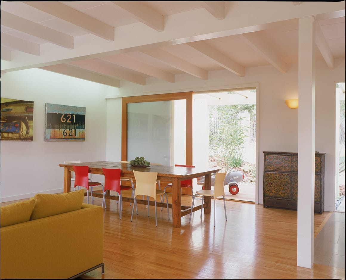
The original house, with its ancient orange carpet and cottage-cheese ceilings, was as a series of small spaces connected by a very long dark hallway. The remodel needed to address the aesthetic and functional concerns of a growing family, taking advantage of a beautiful site, beautiful weather almost year-round, and the owners’ desire for a space that would feel intimate and yet still allow for larger-scale entertaining.
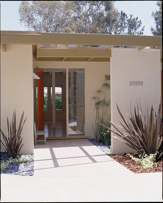
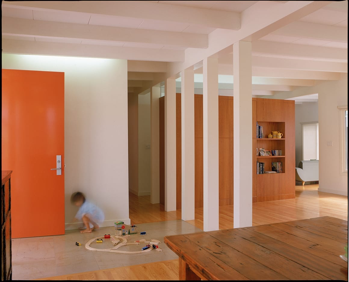
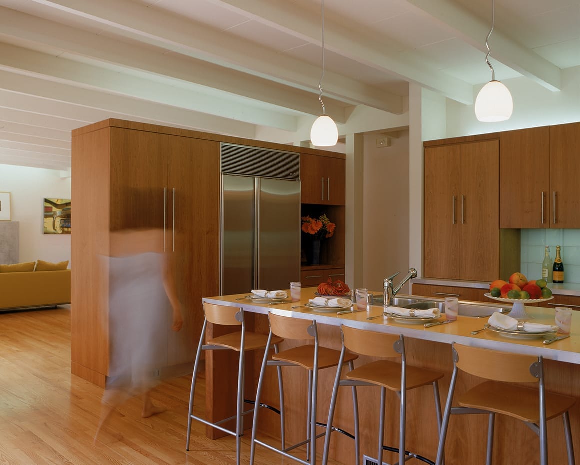
By removing many of the interior walls, the remodel connects the public rooms into one idea, with architectural elements used to minimally define different activity zones. A series of structural columns and a change in floor material define the entry, a partial height cabinet distinguishes kitchen from dining and living areas. The access to the outside works this way too: the oversized entry door opens on a pivot in the middle of a limestone path that serves both as front walk and interior entry floor. A large sliding panel opens one wall of the dining area directly onto a covered outdoor garden, allowing the two small spaces to easily flow together. Intense color is applied as an accent, to offset the otherwise neutral palette of white, oak and cherry wood. The result is a house that feels much larger than it is, with a connectedness of space and an easy coexistence with the outdoors.

as published in:
