SM-ADU
PROJECT TYPE Residential
LOCATION Santa Monica, CA
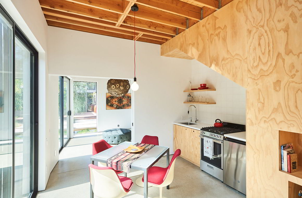
An Accessory Dwelling Unit (ADU), attached to an artist’s studio in Santa Monica.
Sarah Akkoush (Dwell): When the clients first approached you, what did they express were their main needs? How would the ADU fill a functional void for their practice(s) in sculpting/teaching/ writing/filmmaking?
Toni Lewis (L/S): Josh and Stacey had big aspirations for creatively re-imagining the small rear building that was originally built as a detached garage. The ADU should include places to create and exhibit art, meet with clients, and of course host overnight stays for family and guests.
excerpt from interview with Dwell Magazine
You indicate that the ADU “was designed for what we know now and for what we imagine about the future.” Can you elaborate? How did theoretical future uses inform the design direction?
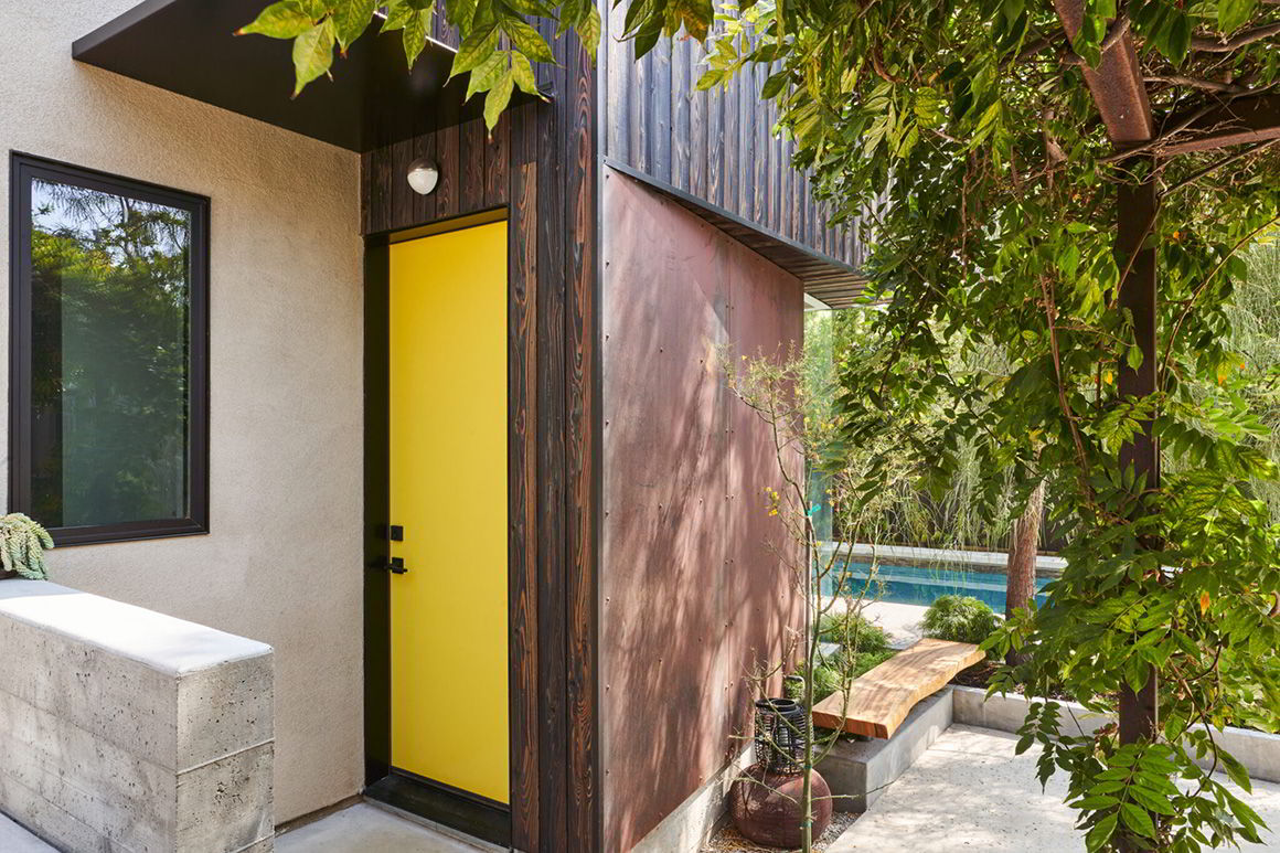
It was clear that the building had to serve as a continuous workspace for Josh. Beyond that, the list of program functions morphed as we thought about them evolving over time. For instance, Josh and Stacey’s daughters are recently out of college, and it was considered that the ADU would be ideal for them to come stay for either short or extended visits in a space separate from the main house, which itself offers little privacy. We discussed how the ADU could be imagined as a place for a future renter or caregiver, and as such it was designed with a door at the rear, which would allow access to use the space through a separate entrance.
Flexibility is the key to longevity in general, and we try to plan enough options in that the space will work in most situations. Last year it turned out the ADU was the ideal place to quarantine during a pandemic! Certainly not something we considered in advance….

How did you decide on the final location of the ADU on the site? Can you comment on any relevant constraints of the lot (“The overall project was able to maintain existing non-conforming setbacks”) and final considerations for siting?
In deciding to marry the new ADU with the existing detached garage, how did you think about creating a cohesive design presence between the two? How does the new ADU respond to the existing garage? (Was it important to weave them together cohesively, or not so much? Not sure if images are available of the ‘whole’ structure, perhaps this will shed light on my question…)
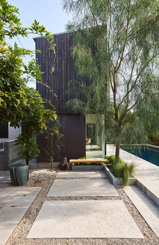
There was an existing detached garage on the site, and we looked at options for tearing down the entire structure and rebuilding, but ultimately decided on a project that saved half the building. This allowed us to 1) keep the building on the property line (as this was grandfathered in and wouldn’t be allowed in a new building), and 2) build both a more cost effective and environmentally considerate project, as we were able to make use of some of what was there before.
We did want to marry the ADU and the garage, without doing a lot of construction on the existing building. To achieve this we added a new parapet at the existing front wall, so that it would be a little taller and tie across to the new ADU, and re-stuccoed entire the garage to match the finish on the rest of the building.

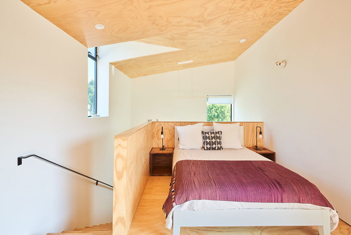
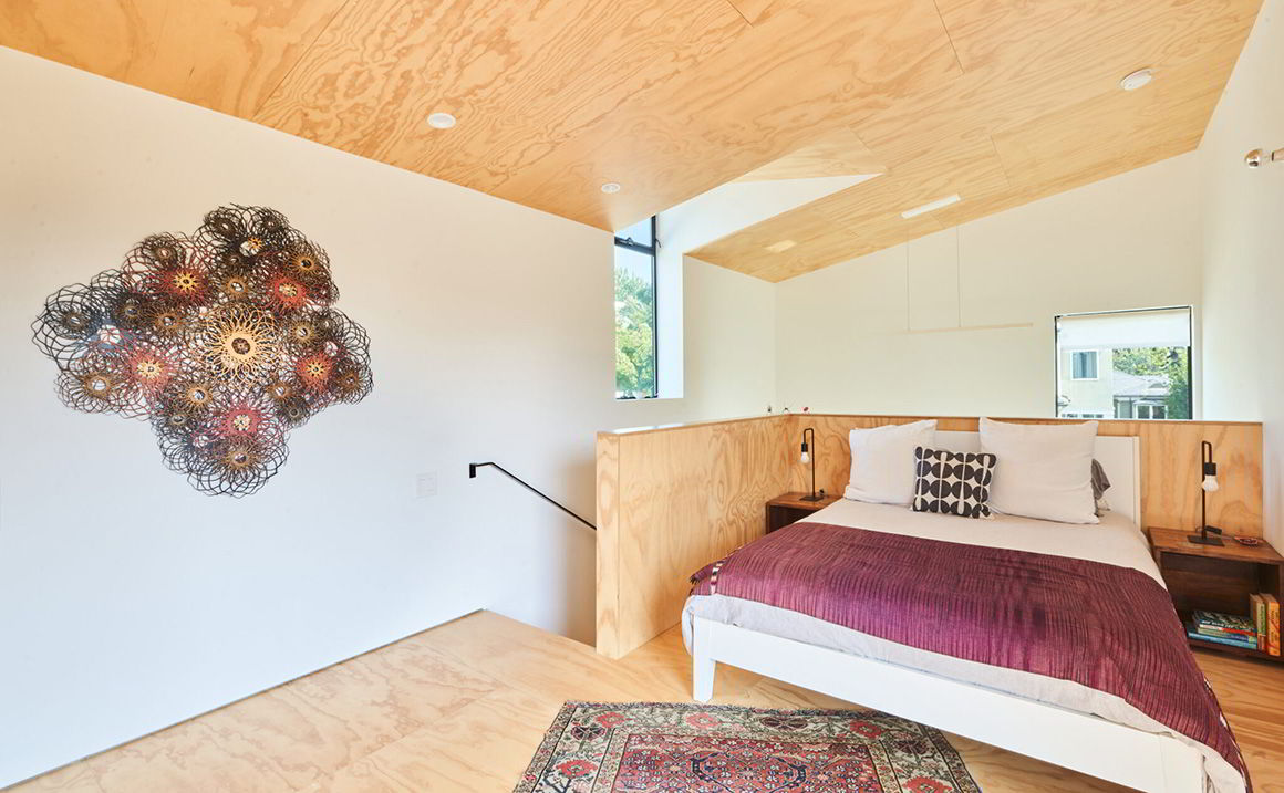

Programmatically, what were the priorities for the ADU’s interior layout? With the compact footprint, what items/spaces were most important to include (and what was perhaps eliminated or scaled back, if anything?)
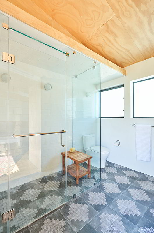
Priorities were Josh’s workspace, although we used the existing garage for that, so that was easy. Second, I think, was a steam shower, and after that I think they left it up to us!
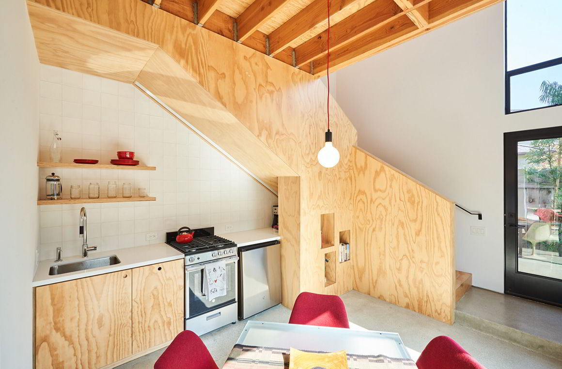
By having the option to divide the gallery space from the kitchen/living space, we actually were able to create perhaps more program than was originally anticipated, even leaving us the ability to include a small double height space – giving the small space a loft-like feel.
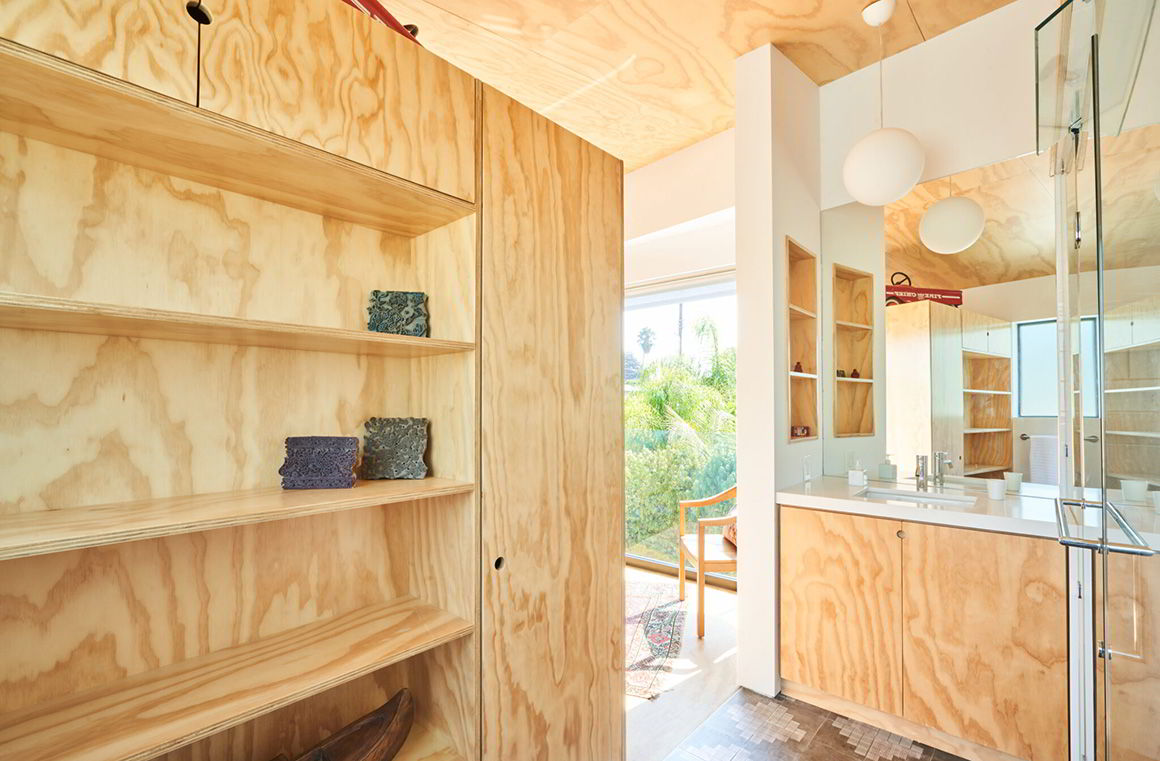
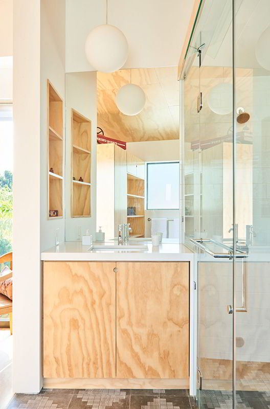
Can you comment on the flexibility of the design? Can the living area be totally closed off from the gallery? (looks like a pocket door in between?)
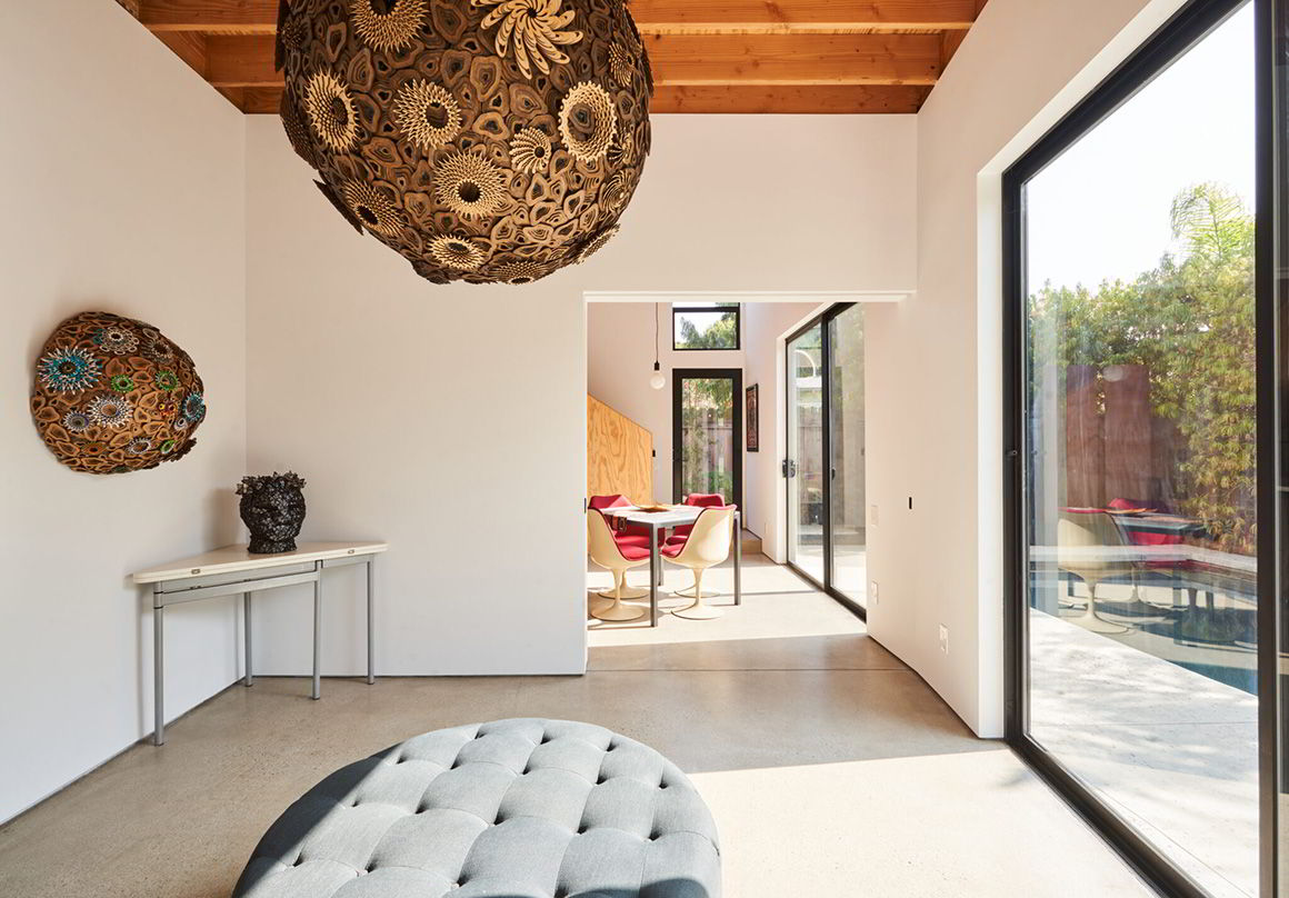
Yes – the gallery and living area can be closed off with a big sliding panel. The reason for this is that if someone is staying in the ADU, you have the option of using the two spaces independently. The workshop and gallery can be accessed from the front door, and the ADU (living space and upstairs loft) can be separately accessed via the rear door.
I love the warmth and simplicity of the interior finishes (love the choice of plywood!). What was the goal or intent for the interior design in terms of look or ambiance?
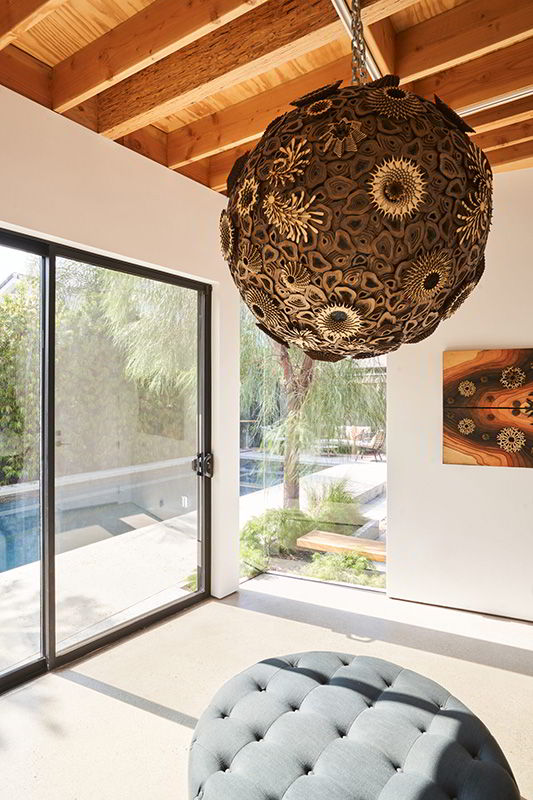
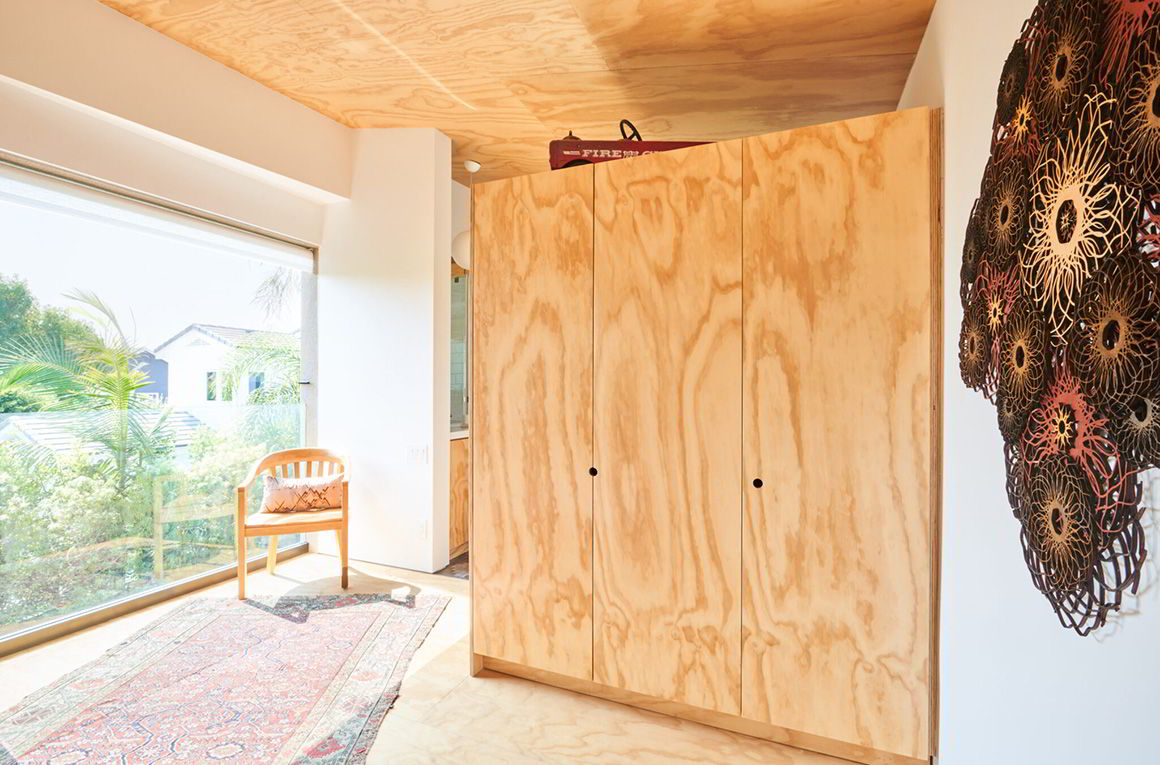
We actually started by looking to Josh’s work for inspiration. He is a sculptor and works with natural materials – mostly wood – and we loved the idea that you would be able to see how the building was built, and what it was made out of. In keeping with both their interests and ours we all agreed the building should be simple, low maintenance, and of course environmentally sensitive. We chose materials that work well in their natural state, like the plywood, the concrete floors, and the steel, and left the joists and the mechanical system exposed where it made sense.
Were there any relevant cost-saving measures that came into play as the project progressed? Any budgetary considerations that informed elements of the design?
Yes! Saving part of the existing structure certainly was considered a way to keep costs down, and probably the biggest move on that front. Inside we exposed structural materials as finish materials where possible – like the structural concrete floors and the exposed second floor framing – which looks great and also eliminates extra drywall and floor finish. On items like the ceramic tile and the light fixtures we made really cost-effective choices, which still look great. Where long-term durability and maintenance was a consideration, we did opt not to be penny-wise/pound foolish, however – for example the countertops are quartz, more costly but also more durable over the life of the building.
Can you comment on the importance of outdoor space, and indoor/outdoor living? Did these needs shift or change in response to the turbulence of the pandemic?
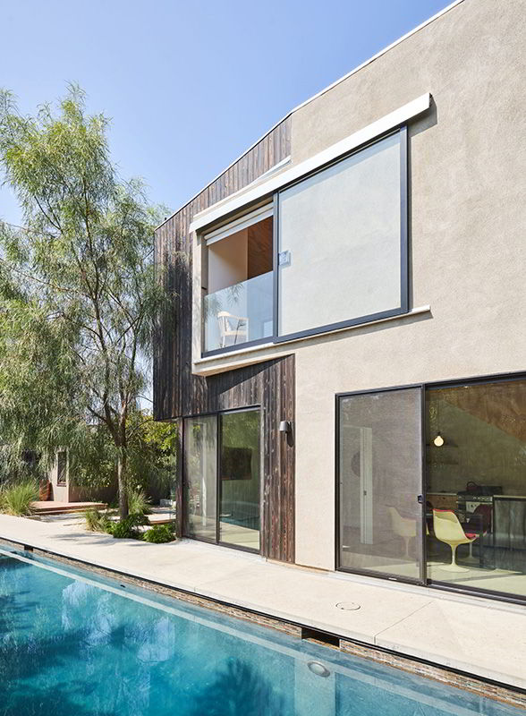
The lower floor opens up to the pool and to an existing outdoor garden and covered dining area. The upper floor has a big sliding panel that opens up to a view to the south. These connections make the smaller spaces feel bigger, and take advantage of the gorgeous Santa Monica weather, so designing those in was obvious from the start. As the structure was put to use as “quarantine housing” during the pandemic those built-in factors were incredibly useful, but of course not something we anticipated. Having the ability to open things up, air things out, and to be able to yell across open spaces from safe distances turned out to be Covid-ready!
Looking back at the completed project, are there special parts or moments you’d like to point out? Any interesting anecdotes or design pivots during construction?
We shared our overall vision with Josh and Stacey of how we saw the building transforming their property and working with their existing house, and they were immediately on board. We all nerded out over the same images of cabins in Norway, got philosophical about corten steel, and talked at length about Josh’s pieces and how the new space could support his work. Josh and Stacey brought us material samples they found, and we made them come try out our virtual reality set-up (which admittedly can be a little dizzying). This project was truly a team design effort, and you feel that in the final product.
Read full story on Dwell here:


