Tilden House / Houzz Tour
Excited to have the Tilden House featured on Houzz. Love this write up!
HOUZZ TOUR: PLAYFUL MODERN MAKEOVER FOR A 1950 BUNGALOW
Architects give a creative Los Angeles couple a smart new layout and fun colors
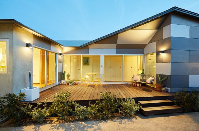
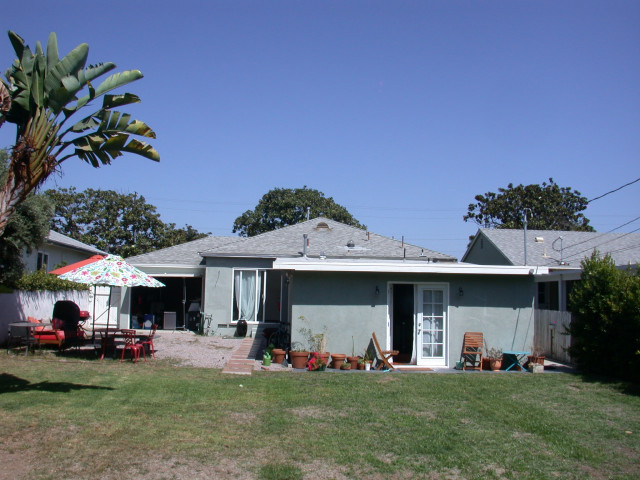
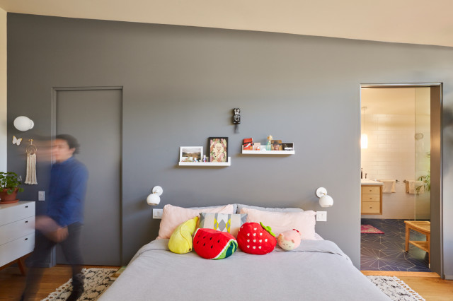
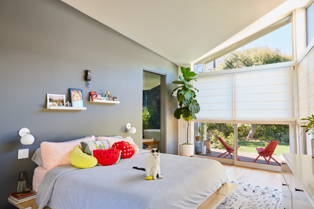
After: Here’s where the big structural changes happened. Before the back of the house was demolished, this side used to be solid house. The new kitchen is through the sliding glass doors on the left side of the photo and the master bedroom is on the right. The tall folding doors are the laundry.
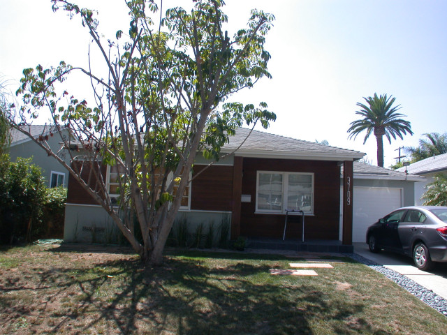
The house before was too “internal,” Lewis says. “The only way out was to walk through the bedroom. They wanted a house where they could entertain in the backyard. To be outside and enjoy that space and take full advantage of the property was important.” The siding panels are fiber-reinforced cement, a durable surface that comes in a variety of colors; it gives the exterior a modern industrial look.
Panels: Cembrit Solid
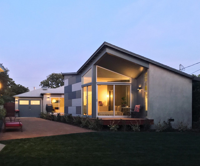
After: When it came to redesigning the back of the house, the architects presented the owners with a variety of models showing different roof shapes. “They were involved in helping decide what was best for them,” Lewis says. “We showed them things that looked like the existing house, and we all agreed to do something that felt new. We took the idea of the original house with its hipped roof and sprung from there. It’s like a modern version of a hipped roof bungalow.”
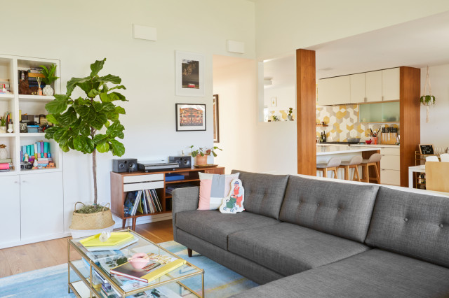
The living room stayed in the same location but “everything about it is different,” Lewis says. The built-in bookcase is new and the wall it’s built into is where the previous kitchen was. The architects moved the kitchen to provide access to the back of the house. A partial wall with a pass-through cutout provides privacy but maintains an open feel between living room and kitchen. “It makes a little connection between the kitchen and the living room,” Lewis says. “The space is very open, which we always like, but there’s always a degree of openness that feels good and not open for sake of being open.
“The wall is high enough so you know this is a bungalow, not a loft. It’s directly open to the dining space but has some visual separation,” she says.
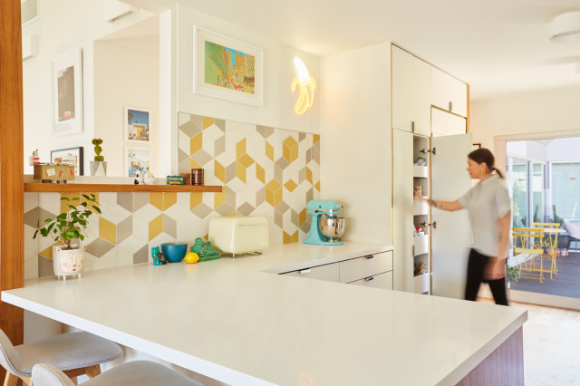
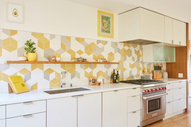
The new kitchen looks compact but is good-sized and was designed in a galley style with plenty of counter space. “One goal was to make something feel fresh,” Lewis says. “One thing they bought into early was that the kitchen would be white but set off with a backsplash that would be fun.” The yellow, light gray and white geometric porcelain tiles set in a cube pattern create a sunny feature in the space. “As soon as we saw this tile we fell in love with it. There’s something about the yellow.… It looks both backwards and midcentury and yet feels very fresh and today,” Lewis says.
Tile: Tex by Raw Edges, Mutina
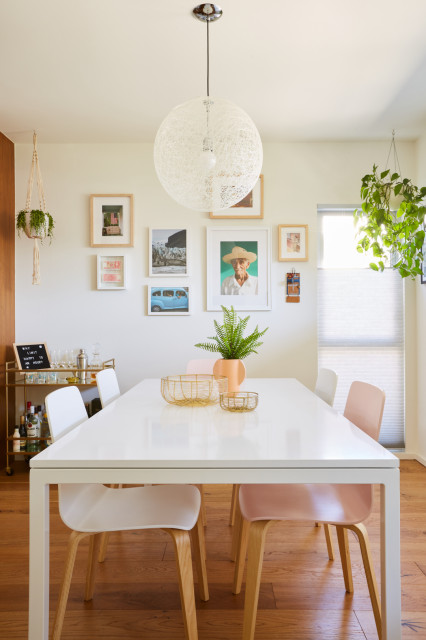
The dining room is in the front of the house, where a bedroom used to be. The new layout made more sense for the home’s flow, Lewis says. “This room is open to the kitchen and that’s important,” she says. Most of the furniture the homeowners already had, and the art was created by them and by friends. “The light fixture we suggested because I like it for spaces where you want it light and bright. It’s diaphanous, which works well in those kinds of spaces,” Lewis says.
Light: Moooi

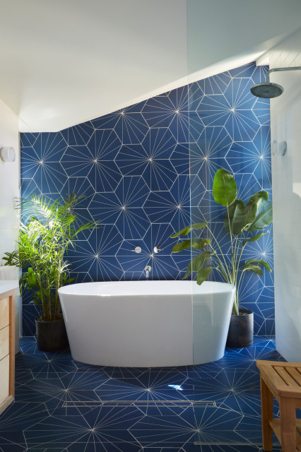
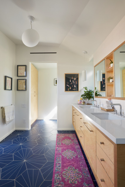
The master bathroom has a celestial feel thanks to deep blue hexagonal porcelain tiles set in a starburst pattern on the walls and floor. Lewis says they chose the encaustic-look tile to make the room eye-catching and still work with the rest of the house. “It’s unique but it only feels like this house. As much as I like yellow in a kitchen, I like blue in a bath because it’s a water color and feels clean,” she says.
The shower and freestanding tub with wall-mounted faucet are situated in a partial wet-room setup, with a slightly sloped floor that allows water to flow into the linear drain. “Once you take a shower here, you can’t go back to a small cube. This has a nice, natural feel,” Lewis says.
Tile: Electra Grande, Neptune; tub; Hydro Systems; fixtures: Kallista
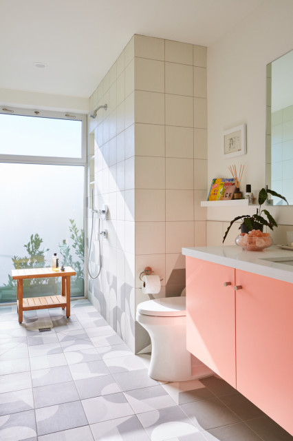
The guest bathroom is a true wet room, with no glass shower enclosure and a generous glass wall that faces the side yard. “We filled the entire wall with glass. Instead of just a little window looking into the yard, there’s a translucent wall of glass instead. It lets in a ton of light,” Lewis says.
The porcelain floor tile from Mutina, which continues up the shower wall, is appropriately called Puzzle. The designers laid out the tiles in a fun geometric pattern for the tile installers. Lewis says she knows the homeowners particularly love their master bedroom, and their bathroom tub, which is “their place to be.” She’s partial to the guest bath with its pop of pink paint on the vanity.
“I love the guest bath and that pink cabinet,” Lewis says. “You don’t always get a client willing to do something outside of what they’d normally do. The fact that they were willing to say yes to the pink cabinet was a joyous moment for a designer.”
Photos by Ivan Feign and Kat Phillips
House at a Glance
Who lives here: Photographers Ivan Feign and Kat Phillips
Location: Mar Vista neighborhood of Los Angeles
Size: 1,800 square feet (167 square meters); three bedrooms, two bathrooms
Architect: Lewis / Schoeplein Architects
Builder: Fischer Construction
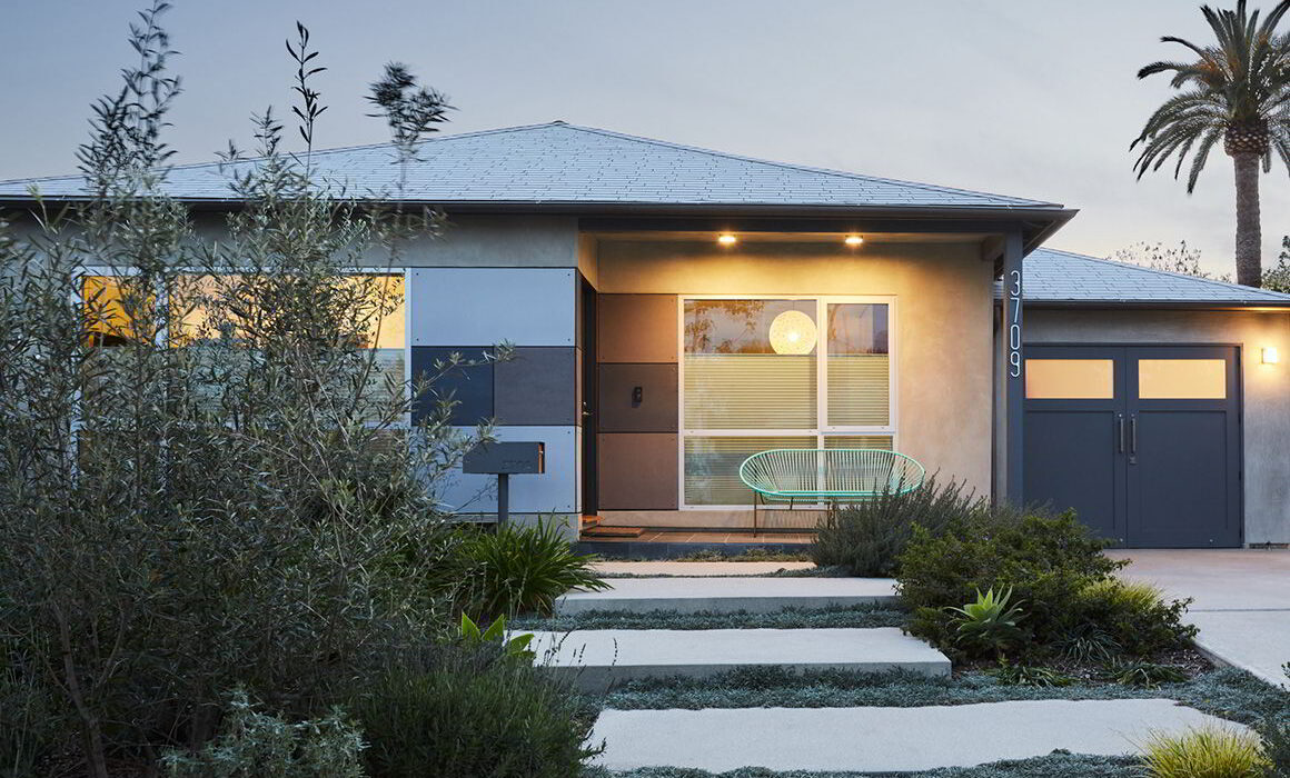
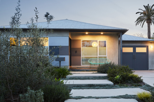
A big challenge for the architects was to connect the aesthetic of the original bungalow with the new style. “One thing we needed to accomplish was to find a way to tie the existing bungalow with the new addition,” Lewis says. Shown above is the home’s entrance and, to the right, the garage, which the owners use as a photo studio. The architects used fiber-cement panels to tie into the new siding in the back. Most everything else is also new, including the windows, stucco and landscaping, which is drought-tolerant with a focus on California native plants, Lewis says.