Lewis Schoeplein
ADU

ADUs : the skinny on Accessory Dwelling Units
ADU

Everyone is asking, so we are answering!

Accessory Dwelling Units – are they new?

Granny flats, converted garages and in-law apartments are not new…  practically speaking they have always existed, and there are many thousands of them all over California. In the past many of these were illegally converted spaces, but in 2016 and 2017 the State of California passed a series of laws requiring cities to relax regulations on these types of dwellings as one step in a broader effort to address a housing crisis in the state. Accessory Dwelling Units (ADUs) have been wildly popular since then, with the City of Los Angeles receiving 67 times more ADU permit applications in 2019 than in 2016!

What constitutes an ADU?

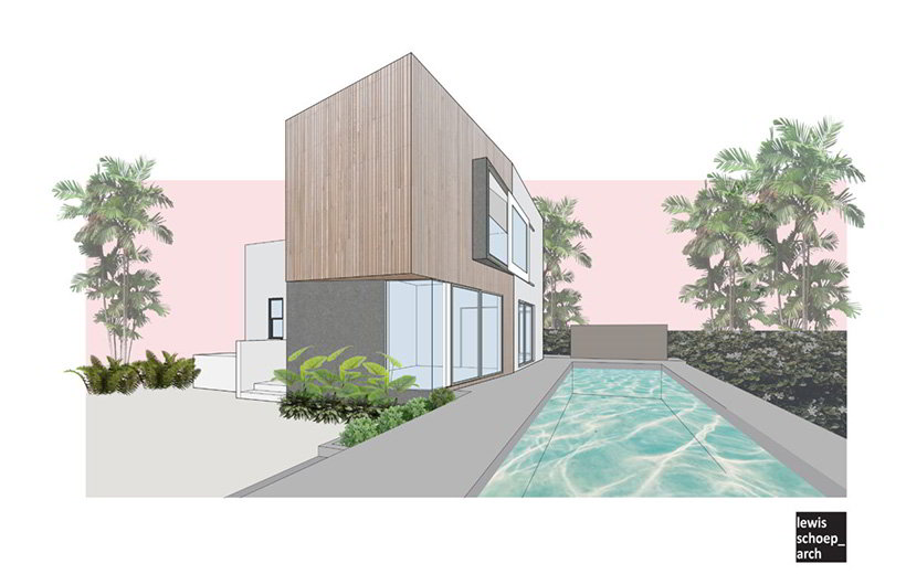
An ADU is a dwelling unit with a full kitchen and bathroom and its own entrance, which can be added to a lot with an existing single-family home. It can be used by the owner, or can be rented out, but cannot be sold separately from the main residence. It can be a detached structure, or attached directly as part of the main house.

Can I build an ADU on my property?

ADUs are permitted in all single-family zones, if it will fit on the lot and is able to meet certain requirements.

What are the restrictions?

Some things dictated by State law include:

  1. An ADU is limited to 1200 square feet, and ADUs that are attached to an existing single-family dwelling cannot be larger than 50% of the existing living areas.
  2. No setbacks shall be required for an existing garage that is converted to an ADU. An ADU that is constructed above a garage cannot be required to have more than a five foot setback from the side and rear lot lines.
  3. Existing accessory structures, when converted to an ADU, are permitted without additional restrictions provided the structure has independent exterior access and side and rear setbacks sufficient for fire safety.
  4. Parking standards are limited to no more than one space per ADU or bedroom and required parking is permitted to be a tandem space on an existing driveway. Parking standards for new ADUs are reduced to zero spaces under certain circumstances:
  • ADU is located within one-half mile of public transit.
  • ADU is located within an architecturally and historically significant district.
  • ADU is part of the existing primary residence or an existing accessory structure.
  • on-street parking permits are required, but not offered to occupant of the ADU.
  • there is a car-share vehicle located within one block of the ADU.
  1. When a garage, carport or covered parking structure is demolished in conjunction with the construction of an ADU the replacement parking spaces may be located in any configuration on the same lot as the ADU, including, but not limited to, covered spaces, uncovered spaces, or tandem spaces, or by the use of mechanical automobile parking

What about my local jurisdiction?

While the ADU Ordinances are based on California state law, many jurisdictions have further defined the local development standards. Be sure to check with your local Planning / Building Department for an overview of specific restrictions for your property, or shoot us an email at mail@lewisschoeplein.com

Where else can I get more information?

The American Insititute of Archiects, California has published their own website with a lot more valuable information. See it here: Plus1House.com

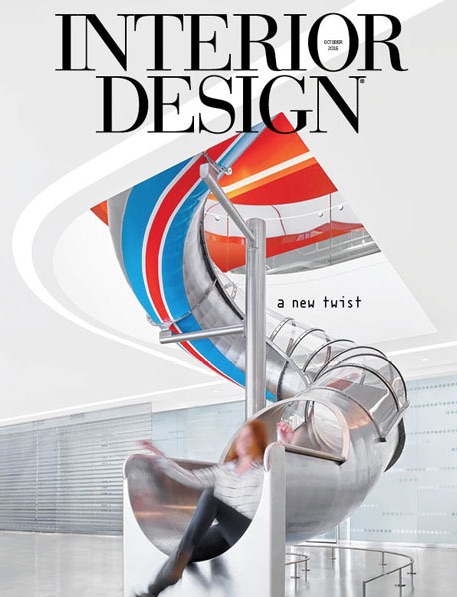
Edmunds.com cover of Interior Design Magazine

Interior Design!

Edmunds.com cover of Interior Design Magazine

So excited that Edmunds.com is featured on the cover of Interior Design Magazine!!   L/Sa served as Executive Architect, working with M+M Creative Studio (Design Architect) on this 133,000 sf project at Colorado Center in Santa Monica.  Check out the entire project at the link below:

Edmunds.com – Interior Design Magazine

Forever 21 storefront

Forever 21 and the ADA

Forever 21 storefront

The first sentence is embarrassing:  I was shopping at Forever 21.  Ok – I can qualify – I was shopping with MY DAUGHTER at Forever 21.

For the uninitiated, Forever 21 is a mass market clothing store founded in Los Angeles in 1984, now with over 600 locations in the United States and abroad.  Its reputation was built on bringing runway fashion to the budget-conscious masses via Chinese factories, but in my house it is best known as the place for the greatest $2.90 t-shirt money can buy.

I typically prefer to order the T’s on-line, but by accident my daughter and I got sucked into an actual store last weekend. Mesmerized by the just-off-the-runways-of-Paris-via-Shaoxing fashion, we ended up at the dressing rooms where, this being a Saturday at the Santa Monica Promenade, there was a line.  As we waited patiently for our turn I noticed that the massive go-back rack of unwanted clothes was parked immediately in front of the door of the largest dressing room – the one designated for disabled access.  Much to my daughter’s embarrassment, the architect in me took over.

“Are you not using that dressing room?”, I asked the skinny-jean-clad store dressing-room sentry, waving my hands at the line of 10 people behind us waiting to try on clothes. “That room is reserved for people in wheelchairs” he informed me helpfully.  At this point my daughter, sensing what was to come, tried to hide behind a cheetah-patterned polyester trench coat.  “You are allowed to use that room for able-bodied people too, actually,” I pointed out.  “Trust me – I’m an architect.”

Guess what? “Trust me – I’m an architect” is fun to say, but it gets you absolutely nowhere with the staff at Forever 21, nor anywhere else I have tried it.  I will keep trying, though, because otherwise why bother with all that licensing?

Next I tried a logical line of reasoning: dressing rooms are like accessible toilet stalls – available to anyone to use if no one else is needing it at the time for a wheelchair. Nope. I tried pointing out that the store has essentially removed 20% of their changing rooms from general use, creating unnecessarily long lines that will discourage more sales!  Nope. By then I was truly curious.  “How many times have you had to move that rack away so a disabled person could access that dressing room?” I asked my new friend.  “Um, never that I can think of.”  Exactly!

And so to the ADA.  The Americans with Disabilities Act became law in 1990, with the purpose of prohibiting unjustified discrimination based on disability.  It has been a positive part of creating a just society, allowing, among other things, people with physical disabilities to navigate through daily life without physical impediments.  This is a good thing.  To do this effectively our goal as architects is to create a world in which all people, abled or disabled, navigate together, not separately.  As we learn (and re-learn every two years for required continuing education credits – but don’t get me started), accessible ramps to front entrances are to be located along the same entrance path as stairs, rather than tucked into a side door. Accessible tables at restaurant or chairs at a theater should be integrated within the overall seating plan.  And toilet stalls (and dressing rooms!) provided for use by the disabled do not need to be singled out and locked up until the day that someone in a wheelchair shows up, making the long line of non-wheelchair users frustrated, angry, and likely to write venting blog-posts.

So, Forever 21, move that go-back rack, open up that dressing room, and let’s all navigate our $2.90 t-shirts purchasing as one.  Thanks.

-TL

*photo cred: tsaiproject @ flickr

UChicago

The Mysterious Happenings of Ricardo Legoretta

UChicago
The entrance to Max Palevsky East Residence Hall at the University of Chicago.

If you went to architecture school in the late 80s / early 90s on the West Coast there were those architects whose work was flagrantly copied by students not talented enough to do their copying less-flagrantly, including Aldo Rossi, “the Franks” (Israel and Gehry), Coop Himmelblau, and Ricardo Legoretta.  Ah – Legoretta.  The square windows, the hot pink and purple, the AIA Gold Medal, that picture with the horse (oh wait – that’s Barragan).

After school Ricardo and I lost touch (architecturally speaking) for awhile, until our firm was hired to renovate part of the Legoretta-designed Bradley Building on the UCLA Campus. It is a signature building, and was a great excuse to break out the colors in the colored pencil box that never get used, creating spaces that respected the original but were still Lewis/Schoeplein.  (You can see the project here: UCLA Office of Residential Life)

When that project finished Ricardo and I lost touch briefly again, until this fall, when my daughter was assigned her freshman dorm at the University of Chicago – a suite in the Max Palevsky Residence Hall, designed in 2001 by Ricardo Legoretta!  (Her first choice was actually the brand new and gorgeous Jeannie Gang building, but apparently everyone else had the same first choice. Ah well.) And so Ricardo and I get to reconnect.

Now, we could get into a discussion here of how a Mexican architect can take an architectural language of Mexico and plop it into the middle of Hyde Park, Illinois, but let’s not. Instead I want to talk about floor plans.

As any architect-mother of a college freshman is bound to do, after her room was assigned I went on-line and found floor plans of the building and room, which I printed to scale.  While I had proudly emerged unscathed from most of the pre-college rituals, including the infamous Bed Bath & Beyond registry (look it up – this is real), these floor plans are where things finally went horribly awry.

This is what I saw:  The Max Palevsky Residence Hall is set up suite-style, with two double rooms sharing a small common space and two half-baths.  The spaces are compact, just big enough for four girls, four beds, four dressers, and four desks….  or is it??!  The floor plans I pulled up showed only one desk per room – two desks for four girls.  What’s up?

What is up, my architecturally astute friends, is a design flaw.  An architectural faux-pas. Someone’s giant construction headache, and someone’s metaphorical sweeping under the rug.

A dorm room, as we may remember from those days before all the doubles were turned into triples (I’m talking to you, UC Berkeley), has a bed on either side of a window, with just enough room leftover for desks and dressers. Kind of like Lucy and Rickie but with bulletin boards and string lights.  What it does not have, unless you are the Max Palevsky Residence Hall, is a boxed-out vertical shaft approximately 18” square poking into one corner of the outside wall of every room, making it impossible to put a bed against that wall.  I know you’ve been waiting…. here is the plan:maxpdoublesuiteAnd so I am left to ponder how the shaft was put there, and why couldn’t they use part of the closet if they got into trouble during construction? I try to understand who thought putting beds in an L-shape was a comfy way to sleep (maybe the kids can share a pillow?). And I deal with it the only way I know how: I pull out the trace paper.

I spent the better part of a Sunday morning drawing new furniture arrangements, ones that would include TWO desks and separate pillows.  It wasn’t easy, and what I came up with still may not work.  Not sure what the roommate will think.  I’ll let you know how it goes – I am writing this on the plane on the way to Chicago, on my way to rescue the 700 impressionable young minds about to move into the Max Palevsky Residence Hall.

-TL

*photo cred: Jamie Manley @ Flickr

Privacy Settings
We use cookies to enhance your experience while using our website. If you are using our Services via a browser you can restrict, block or remove cookies through your web browser settings. We also use content and scripts from third parties that may use tracking technologies. You can selectively provide your consent below to allow such third party embeds. For complete information about the cookies we use, data we collect and how we process them, please check our Privacy Policy
Youtube
Consent to display content from - Youtube
Vimeo
Consent to display content from - Vimeo
Google Maps
Consent to display content from - Google